Monday, November 22, 2010

Roman Art & Christian Art

Roman Art
“Imperial Procession”
Detail of a relief of the south side of the Ara Pacis
13-9 BCE.
The Ara Pacis Augustae is a monument made to commemorate Augustus’s triumph of enforcing Roman rule in Gaul and Hispania.  Most of all, the monument celebrates the establishment of peace in Rome.  Augustus dedicated the monument to his wife, Livia for her birthday as well.  The “Imperial Procession” is one of the friezes of the Ara Pacis, inspired by the Parthenon’s procession frieze.  In a sense, the “Imperial Procession” is somewhat used as a promotional device.  Augustus wanted to use art to promote and present his new order to be a Golden Age, reminiscent of the age of Athens under Pericles’ rule.  A political as well as an artistic statement is made in the procession.  The scene depicts the imperial family and others waiting for a ceremony to begin, while children tug at their elder’s clothes and converse with one another.  It is peculiar that children are being represented acting like children during this era.  It had rarely been done before.  Usually children are shown acting like adults, only miniature.  But Augustus embraced the idea of children acting as children not out of warmth compassion for children, but rather because he was concerned about a decline in birth rate among Roman nobility.  So in this frieze, Augustus uses art to promote his political and social ideals of marriage, marital fidelity, and raising children.  Actual specific people are also portrayed in the “Imperial Procession” which in a sense, is a political tool used to draw people into the scene so they are able to identify with people like themselves.  The average public is portrayed; families, children, and nobles, and even specific people. The scene also depicts men with their families representing marital fidelity.  Private family and community closeness is a major theme of the Ara Pacis, including the Imperial Procession.  Augustus aimed to convey all of Rome in a peaceful state, which would be known as Augustus’ great accomplishment as a ruler; Pax Romana ( the period of stability, internal peace, and prosperity Augustus began which lasted over 200 years.) The Ara Pacis serves as a monument commemorating the times of peace Augustus brought to Rome.  
Christian Art
“Sarcophagus of Junius Bassus”
359.
The “Sarcophagus of Junius Bassus” is a great example of art which portrays the period of conversion to Christianity.  Junius Bassus was a Roman official who was “newly baptized.”  He died on August 25, 359 at age 42 and converted to a Christian on his death bed.  The sarcophagus is decorated with columns, entablatures, and gables which work to divide the space into five separate scenes on two registers.  It is a very detailed work; the architecture, furniture, and foliage details portray the setting of each scene.  In the upper register Christ is portrayed as a teacher, with Saints Peter and Paul at his side.  The imagery of the sarcophagus is meant to represent the transition from paganism to Christianity in which Junius Bassus had made.  In one scene this transition is demonstrated where Christ rests his feet on the head of Aeolus, who is the classical god of the winds.  So in essence, Christ is shown having dominion over the pagan god. The transition from paganism to early Christian art was also made apparent when Jesus in many of these scenes is enthroned as a Roman emperor (which also really works to promote a good and idealized perspective of Roman rulers.) On the bottom register, Jesus makes his entrance into Jerusalem much like a Roman emperor who has conquered a city, only he is shown in a much more humble manner, riding a donkey.  In Early Christian art, narrative themes and allegories were very popular, and it was also not uncommon to find the Old Testament themes foreshadowing the events of the New Testament.  For example, Old Testament and New Testament scenes are depicted on the sarcophagus.  In the top left Abraham passes the test of faith and other scenes show Daniel saved by God from the lions, Adam and Eve and the fall, Christ’s Passion, his arrest (a New Testament theme), and Pontius Pilate washing his hands of guilt, as well as Peter’s arrest, (more New Testament themes). The Crucifixion itself does not appear on the sarcophagus though. In fact, it was very rare that the cross would be shown in early Christian art.  Perhaps the artist of the sarcophagus focused more so on Jesus’ life as a teacher and miracle worker rather than his death and suffering to avoid bringing to light that Jesus died at the hands of the Romans. The power of the Roman Church was to be emphasized as well through these images, so a good reputation of Rome was meant to be instilled by the scenes of the sarcophagus.  
-----------------------------------------------------
Significant changes in style distinguish Classical Roman art from Early Christian art.  Classical Roman tradition seems to be characterized by advertisement and the promotion of rulers.  In many ways, Ancient Rome seems to resemble the United States today.  The Romans recognized the importance of the portrayal of their political leaders, which made the art of portraiture very crucial.  It was used as propaganda to influence the masses.  Although the “Imperial Procession” of the Ara Pacis does not depict a portrait of Augustus, it does in fact show specific individuals, noblemen a part of politics of the time, and potential heirs to the throne, such as Marcus Agrippa, who would have been Augustus’s successor if he hadn’t died.  Augustus’s wife, Livia, is also depicted.  And the Ara Pacis is certainly an entire advertisement in itself, built to commemorate Augustus’s peace, Pax Romana, he instilled in Rome, as well as his ideals and laws; celebrating families and the community.  It works as a form of persuasion, assuring the Roman people that all is and will be well under the reign of Augstus, and his legacy will live on.  I find the transition from Classical Roman art to Christian art to be very interesting; it is not a clean cut transition by any means.  Pagan symbols and imagery were being infused and combined with Early Christian art, which allowed the public to shift perspectives.  A work could be viewed as pagan art and Christian art as well.  For example, in the “Sarcophagus of Junius Bassus” Jesus is seated with his feet standing on the wind god.  This could be interpreted in two different ways; it could simply represent Juinius’s conversion from paganism to Christianity.  But also, in the Christian’s eye, it could symbolize that Christ is in heaven with the wind and sky, which combines both Christian and pagan symbols.  In Classical Roman style, emperors are usually the main focus of attention. Art is used as a tool by the emperors to influence the public (much like television).  Christian art appears to be more humble and focuses less on rulers and more so on glorifying Christ.  For example, on the “Sarcophagus of Junius Bassus”, Christ is placed in the center of the top register and no contemporary Roman nobility are present on the sarcophagus, not even the deceased.  Yet Christ IS being portrayed in the adornment of a Roman ruler.  Perhaps the artist did this to make Jesus seem as though he is one of the Romans, someone the Roman people could identify with and believe in.  Or perhaps it is to show that Roman rulers are close to Christ and should be well respected.  A clear example of Early Christian art that idealizes the Roman emperor is “Justinian and His Attendants.”  Justinian is placed in the center of the mosaic and resembles Jesus Christ, perhaps to convey his strength and his beliefs as a Christian. 
The sarcophagus also demonstrates the use of narratives, which are heavily used in Christian art because most people of the time were not able to read, so they relied on the art of narratives to teach them of Christianity.  The scenes unite the imagery of the Old and New Testaments.  (Simultaneous narrative is also a technique used to convey Biblical stories.)  Christians used the visual arts to glorify God (and sometimes used art as propaganda for a ruler as well) while during the Classical times, the central focus of art was usually on an emperor and functioned to communicate his message to the public as in the “Imperial Procession.” 

Saturday, November 6, 2010

Parthenon Project


   The Parthenon
Patron Goddess, Athena
Athena, Goddess of Wisdom, Love, Crafts, and War, was the most important and respected God among the Athenians.  Athena is depicted on both the East and West Pediments of the Parthenon.  The East Pediment portrays the Birth of
Athena while at the West is the contest between Athena and her Uncle, God of the Sea, Poseidon, to see who would become the patron god.  Both Gods had to present a gift and the best gift would determine who would be the patron god. 
The West Pediment depicts Athena and Poseidon at the center.  The two figures appear to be in the midst of a battle, in mid-action.  On either sides of the gods is a procession of people backing them up, perhaps representing the support of the Greek people.  


Athena Parthenos

 Mixing Doric & Ionic Elements...  


The cella had a two story Doric colonnade around Phidias's statue of Athena while the back room which housed the treasury had four ionic columns.  The exterior of the Parthenon has a Doric frieze, while the inner frieze is ionic.  Perhaps the mixing of doric and ionic elements to make the Parthenon was meant to convey the fact that Athens was the leader of all Greeks.
I had never visited the inside of the Parthenon before this project, and found it very interesting how different styles of Doric and Ionic styles were mixed.  The mathematics for the making of the Parthenon also really intrigued me; the slight curvature of the floor of the temple, as well as the overall preciseness of the entire design.


Sunday, October 31, 2010

Greek Pottery: The Many Hydriai

Greek potters aimed to create vases that would be aesthetically beautiful and also have a utilitarian function. They had to design motifs based on the use or function of a vessel.  Athens was the main center where pottery was created and manufactured during the Archaic Period in all of Greece.  Black-Figure vases were invented which resembled stylistically, the Geometric period, but then evolved into the amphora- a large, all purpose storage jar, which usually depicted illustrations of the wine god Dionysos.  Then, in the last third of the sixth century BCE, a new technique came about called red-figure decoration.  It was characterized by red painted figures against a black background, which is the opposite of black figure painting.  In essence, Greek pottery was evolving from the initial intricacies of engraving, to having more freedom in painting.

The hydria, deriving from the Greek word for water, is a pot made for fetching water.  The hydria usually  depicts scenes of women carrying water from a fountain which was one of women's duties of the time.  Once again, the Greek vessel has a utilitarian function of holding water, and is painted with imagery to reflect its purpose.  It has two horizontal handles at the sides for lifting, and a vertical handle at the back for dipping and pouring.  Most hydriai are bronze and t erracotta.

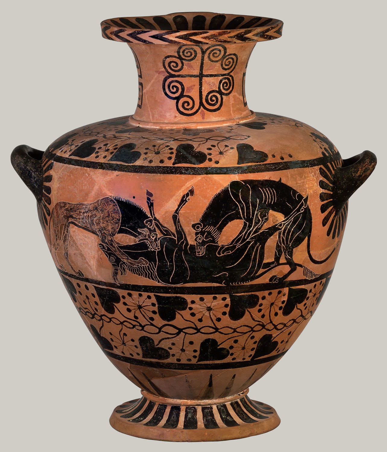
Terracotta hydria evolved from the seventh century BC to the third century BC from having a wide body with a rounded shoulder to more of one with a flatter shoulder, meeting the body at a sharp angle.

Terracotta hydria (water jar), ca. 520–510 B.C.

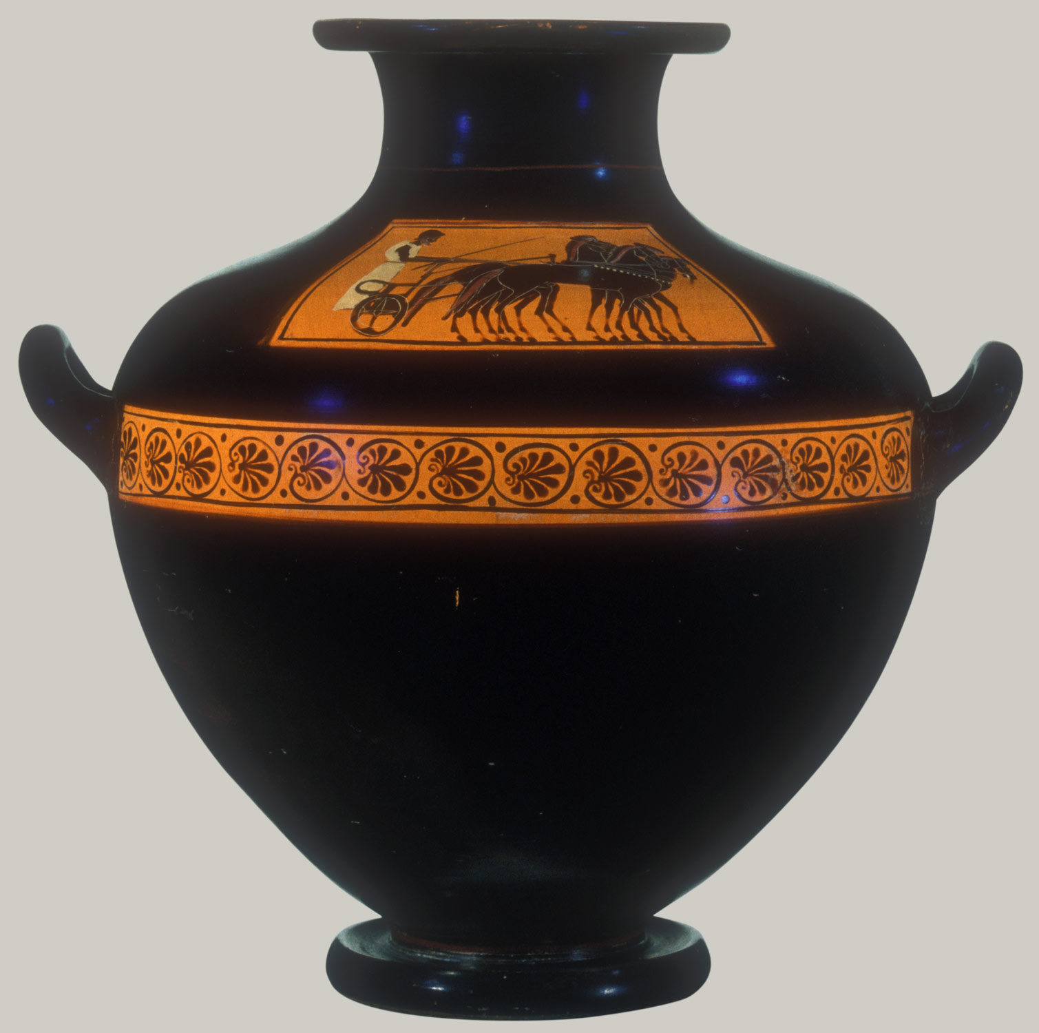
By the end of the sixth century BC a spin off of the hydria evolved called the kalpis.  It had one continuous curve from the lip through the body of the vessel.  The kalpis became the favorite vessel among red figure painters.


Terracotta hydria: kalpis (water jar), ca. 510 B.C


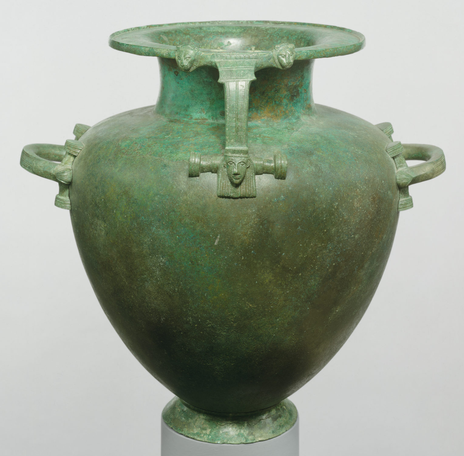
Terricotta black glazed hydria of the late Classical period were painted of gilt wreaths representing actual gold funerary wreaths.  Many hydria depicted funerary scenes.  Bronze Hydriai, with hammered bodies and feet and handles, featured sirens, which were also funerary connotations, representing death.  Many of the bronze hydria turned green from corrosion from over the centuries.  (I think they look really cool like this!)


Bronze hydria (water jar), late 7th–early 6th century B.C.


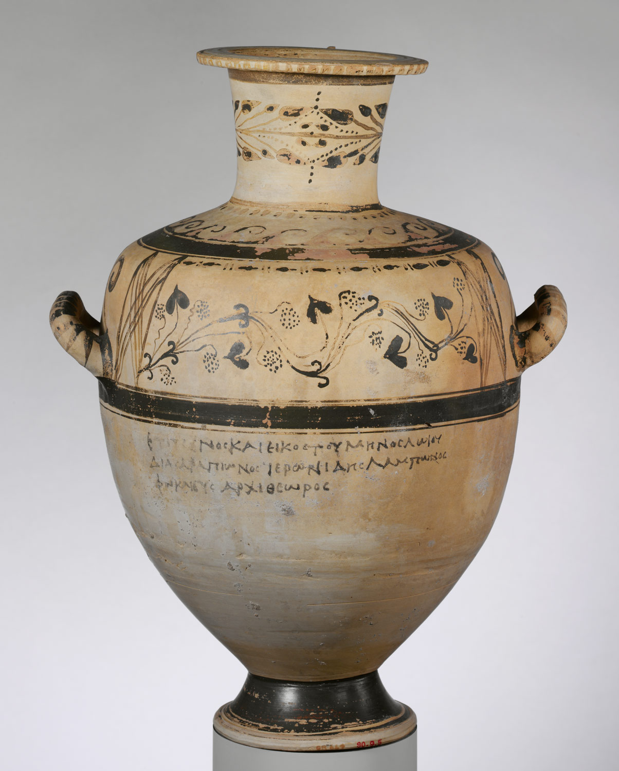
The Hadra Hydria is representative of the Hellenistic period.  It was a water jug used as a cinerary urn, decorated with black paint, usually bearing inscriptions that identify the year in which one had died.


Terracotta Hadra hydria (water jar) with funerary inscription, 226–225 B.C.


Sunday, October 24, 2010

The Modern Egyptian

http://prezi.com/is2i776j2pta/the-modern-egyptian/

Link for The Modern Egyptian


Monday, October 18, 2010

Andy Goldsworthy- Artist Review

http://www.documentaryfilms.net/Reviews/RiversAndTides/
Andy Goldsworthy- Artist Review by David Loftus

As the tide carries his driftwood igloo out to sea, spinning it slowly and dismantling its structural unity, he remarks: “It feels as if it’s been taken off into another plane, another world. . . . It doesn’t feel at all like destruction.”

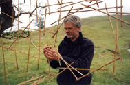
I agree with the author's perspective.  David Loftus, in essence, appreciates and upholds the artist's, Andy Goldsworthy's, outlook on art.  Goldsworthy believes that the media an artist can use in limitless, and he proves this by using only natural materials and nature itself as his subject matter. The author stresses the ephemeral quality of Goldworthy's art.  All of his sculpture's have a life, a beginning and an end, which makes them seem as though they really have become a part of nature, and a breathing entity.  Some of his art won't have a longer lifespan than 20 seconds.  Loftus interviews Andy Goldsworthy and comes to the conclusion that it doesn't matter to Goldsworthy that his art deteriorates so quickly.  It is in fact just what the artist intended to happen to his art.  He does not want to "capture" the wonderful energy of nature, but instead he wishes to "participate" in it.  Goldsworthy stated that it seems as though his art is not destroyed by nature, but rather that it moves with nature into a different realm.  I thought this was an interesting perspective on art and life, and passing into death.  It seems as though Goldsworthy is satisfied and happy just to be a part of nature and its energy, that the actual change and destruction of his creations are not looked upon as a negative thing. Change is trusted in Goldsworthy's perspective, because of the fact that it is a part of nature, as is death.  All of his sculptures are weathered by the natural elements which eventually cause their death.    


Bull Leaping

Bull Leaping is a wall painting of the late Minoan period, 1550-1450 BCE. and is located in Knossos, Crete.  Aegean art was very much so influenced by the sea because the cluster of Islands known as the Cyclades were surrounded by the Aegean Sea, therefore resulting in many organic forms, shell like patterns, and a lot of motion!  For example, the border of Bull Leaping is of a repetitive pattern of forms that look like jelly fish, also resembling the flow of waves.  And motion is also a major element conveyed in this wall painting.

Motion is conveyed in the border as well as the actual Bull Leaping event taking place.  The women are the lighter skinned figures and the man is supposedly the darker figure.  The woman to the left holds the bull's horns, perhaps preparing herself for the jump, while the man is in the process of jumping the bull in mid air, and the other woman on the right is standing ready to catch the man.  The bull is in action as well, as he leaps in mid air.  Everyone is in motion.  There is also a passage of time present in this piece.  It shows the process of Bull Leaping, almost like a 'how to...' demonstration.  Bull Leaping may represent a fertility or initiation ritual of a sort.  


Saturday, September 18, 2010

SUE TOMPKINS

SUE TOMPKINS
I first heard of Sue Tompkins about two years ago and was intrigued by her work and performance art.  She is fascinated by rhythm, whether it’s the clicking of her typing (on a typewriter) or simply just the way words sound when they are repeated.  Tompkins does not focus on the meaning of words in the usual context, but instead repeats and syncopates words to make us rethink what language really is, and how words can be used in different ways to create different meanings. Tompins helps us look at words a part from their usual associations and mundane contexts. 
I found an article reviewing one of Tompkin’s performances of 2004, “No More Cola Wars”, written by Michelle Cotton.  The idea of a ‘cola war’ stemmed from the subliminal advertising of Coca Cola in the 1950’s, where an experiment was conducted in a cinema.  ‘Drink Coca Cola’ would flash on the screen for less than one second every five seconds in hopes that the audience would buy more Coke. In this performance, Tompkins repeats words and phrases out of context to create a new sense of meaning and acknowledgement of the words she carefully chooses. “Tompkins loops and re-plays words and phrases so that a rhythm is struck through repetition” according to Cotton. The main idea Cotton communicates is that Tompkins’ work is very effective, catchy, and meaningful in a different way. “Tompkins is interested in testing how language can acquire meaning or permanence through rhythm, repetition and variation of tone so like music it becomes endlessly replayed, whether it's heard or not.”  I find this relates also back to the idea of subliminal messages, and the Coca Cola experiment.  I am inspired by Tompkins’ work; how she is able to use words, mundane phrases and tunes in a new way, which ends up communicating an entirely new message.  I learned from this article review that it is not so much what words/materials you use to communicate that matter (it could be as simple as ‘Drink Coca Cola’!) but instead, HOW you use these words/materials can make a transforming difference.  For example, the tactic of the subliminal messages, or Sue Tomkins’ unusual repetition of words and sentences-something very new, inspiring, and even powerful could be communicated to the audience.   
    

The Narmer Palette


The Narmer Palette 
2950-2775 BCE.
The Narmer Palette represents the unification of northern and southern Egypt under King Narmer.  The palette was used for grinding eye paint which the Egyptians, both men and women, used to protect their eyes from the sun by reflecting the light.  There is great symbolism in this piece conveyed through iconography.  His name is represented by a horizontal fish (nar) and a chisel (mer) at the top of the register.  Narmer is protected by Hathor, the human face with cow ears and horns at the top of the palette.  The artist of this palette used the hieratic scale to convey the least to greatest figures.  Narmer is the largest, representing his power as a ruler and unifier of Egypt.  He stands in the composite pose, ready to strike the helpless enemy over the head. Beneath Narmer are the dead, proving his power and victory.  Narmer also wears the crown of upper Egypt.  The falcon, representing the god Horas, stands on top of the papyrus, a plant symbolizing Lower Egypt and also representing Narmer’s dominion and victory.  The falcon also appears to have seized the head of a man, perhaps representing Lower Egypt again. 
The other side of the Palette is divided by three registers, which makes for a balanced, interesting composition and also seems to show a timeline of the order in which the events of the battle took place.  Near the top of the Palette, Narmer wears a hat of Southern Egypt, proving he has taken control.  Corpses lay in lines, representing the enemy, Southern Egypt.  Below, two creatures with very long intertwining necks, creating a circle, represent the fact that Northern and Southern Egypt are now one and strong, under King Narmer.       

Sunday, September 12, 2010

Collage Project


Through my collage, I wanted to convey the beauty of life/nature, as well as the fast moving society we are a part of here in America.  I depicted a sun setting on the ocean, which represents my home in Florida.  It also represents the beauty of life and my home.  Then, above the sunset, there are four red points in the sky representing my family.  The red points are connected by film strips to show they share a bond and are together.  The film strips also represent roads, and an outline of a road leads from the family to downtown Franklin, my town.  I used an x-ray of my dad’s artery to represent Hillsboro road, which leads to Belmont; the brick rectangle.  The moon is to the left in a red sky.  I wanted the red to represent inspiration and art.  I believe art is in everything, especially nature!  Also branching off of the family constellation are two antennas which represent a satellite/music/and sound.  My family and I all play music together and that is a great part of our bond.  There are sound waves coming from the antennas, leading our eyes to the moon.  I included pictures of my friends in the ocean, also serving as memories.  There is also another antenna in the ocean only this one represents a cell phone antenna, because sometimes I feel as though my cell phone is taking over my life!  It also represents a way of communicating with friends, just another way to stay connected, which is a great part of our society today.  There is a brown rectangle in the far right corner which represents a building/factory spewing money (the green rectangles).  I feel this also symbolizes the values of America.  Our country is also very fast moving and rapidly changing so I wanted to create a sense of movement in this piece to convey the energy of America.  And I believe all of it is art, everything is connected. 
You: The sun represents me.  I’ve always felt a strong connection with the sun, growing up in Florida. It also represents my home, both the sun and the ocean. Also, the antennas in the sky represent my love for music and sound.  The colors represent my love for art and nature. 
Friends and Family:  I included pictures of my friends in the ocean on the collage which are very nostalgic memories. The four points in the sky represent my family; me, my mom, dad, and sister.  We are connected like a constellation and depend on one another. 
Your town, community, school:  My town, Franklin, is represented by the circle and roads above the family constellation.  The circle represents Downtown Franklin, a place I always go with my sister.  Then, branching from Franklin is a road, Hillsboro Road, leading to Belmont; the brick rectangle which is surrounded by green; the beautiful campus.  
Your country:  I wanted the movement in the piece to help represent the U.S.  Everything feels so fast paced here, we never stop moving!  Yet there is also a lot of change taking place in America.  Also, the money tree/factory/building on the right represents American values.
The world today:  Again, I wanted the movement and energy to convey fast paced society, our world today, as well as the cellphone antennas.  
Art:  I believe you can see art in everything and anything if you want to.  I included some  water color scraps I had painted to represent my love for art; the red in the sky as well as the orange.  Art has a way of connecting us, like cell phones, music, etc..
History: I thought of history as memory.  The ocean and sun is where I came from, and above it in the sky is my new home in Franklin, TN, and then Belmont is also another home to me.  In a sense, this collage is like a timeline of my moves in life.  They keep building off of one another and I keep learning more and more each move.

Friday, September 3, 2010

Art in Review; Agnes Martin


"Art in Review," by Roberta Smith, is a critique of Agnes Martin's, a great minimal artist's, work.  Smith appreciates Martin's earlier work of the 1950's and 60's rather than her later work- to her death in 2004.  Smith recognizes Martin is an extreme minimalist artist, yet seems to describe Martin's work very mundanely.  I do not agree with this author's opinion of Agnes Martin's art.  I think of Agnes Martin to be somewhat like Mark Rothko.  Minimal art can appear cold, as Smith states referring to Martin's art work, but if one meditates long enough on whatever minimal mark, line, color, texture, light that is being portrayed, the work of art can become very strong and have a great affect on the viewer.  I really love Mark Rothko's paintings!  I've read that some people who have seen them in person have felt spiritual revelations and the simple colors had a great effect on their emotions.  I think this is the beauty of minimal art.  It really makes us slow down and really look at whatever little or simple piece of information is being portrayed.  It also can help us listen to ourselves.
Agnes Martin's work has always inspired me, her newer work as well as the old.  Perhaps the critic of this article does not know or appreciate the excitement of the ambiguity of minimal art, which is understandable because minimal art, like all other artistic styles, is very personal and one must have the taste for it, much like one would have a very different taste for Andy Warhol.  The central thesis of Smith's review is that Agnes Martin's work did not improve as she grew older; her concepts grew colder, more minimal, and ambiguous. I disagree, finding Martin's work to be a positive progression throughout her art-making career.
"Arranged by formal likenesses, the display moves from vertical elements to horizontal ones to occasional intersections of both. There are side trips into triangles and some atypical floating shapes, including circles, squares and, in one case, angled planes that cause a rare foray into deep pictorial space."   This is a quote from Smith's review describing Martin's later work.  I find this description to be simple and true.  It relates to the formal elements of art we've discussed in class.  The formal elements of line, shape, and color harmonize perfectly in Martin's work.  Her line variation, repetition of shapes, calming colors create a very individualistic style.  It is so difficult to create minimal art, I feel, because whatever information is laid down is extremely important because of its rarity.   

"Starry Night"


1889

Vincent Van Gough was heavily influenced by Seurat's idea of divisionism.  He let the two stylistic techniques of divisionism and Impressionism mold and transform his style of painting.  Instead of painting clusters of dots, Van Gough stretched out his brush strokes and created lines that give the painting "The Starry Night" its life and energy.  The wonderful movement conveyed in this piece is created by these multi-directional dashes/lines.  The lines of the sky oppose each other, insinuating that there is movement in the sky; perhaps wind or a storm on its way. The counterbalance of lines and the diagonal axis created from one end of the sky to the other helps ground the image and direct our focus.  The movement of the lines (the direction of which they were laid down) works to balance the piece also.  Triangles are created by the directions of the flowing lines, for example, look at the dark ominous looking tree/bush in the foreground, it is made of fairly vertical lines.  Now look at the lines of the sky directly to the left of the tree, they are horizontal lines, which then takes out eye to the curving lines of the clouds and then the moon.  This triangle really pleases the eye and also balances the composition.  By applying the paint so thickly, a beautiful texture and new sense of depth is made.  This texture also contributes to the momentum of the "Starry Night."
Light is a very important part of this painting as well.  Bright yellows surround and fill the stars, which makes it looks as though they are glowing and pulsating.  The light is not realistically painted but there was no purpose for it to be.  Instead it is very dramatic and intense, conveying the artist's emotional state. "Starry Night" is recognized as one of the first Expressionistic paintings, because the intensity of the artist's emotion is more important than the actual appearance of things.
There is high energy and ambiguity.  When I look at this painting, I do not feel happy or sad, I just get excited!  I sense  there is something going on, things are about to change, wind is blowing.  The energy and life of this piece feels most like excitement and inspiration to me.  You get the feeling that it's breathing.

Thursday, August 26, 2010

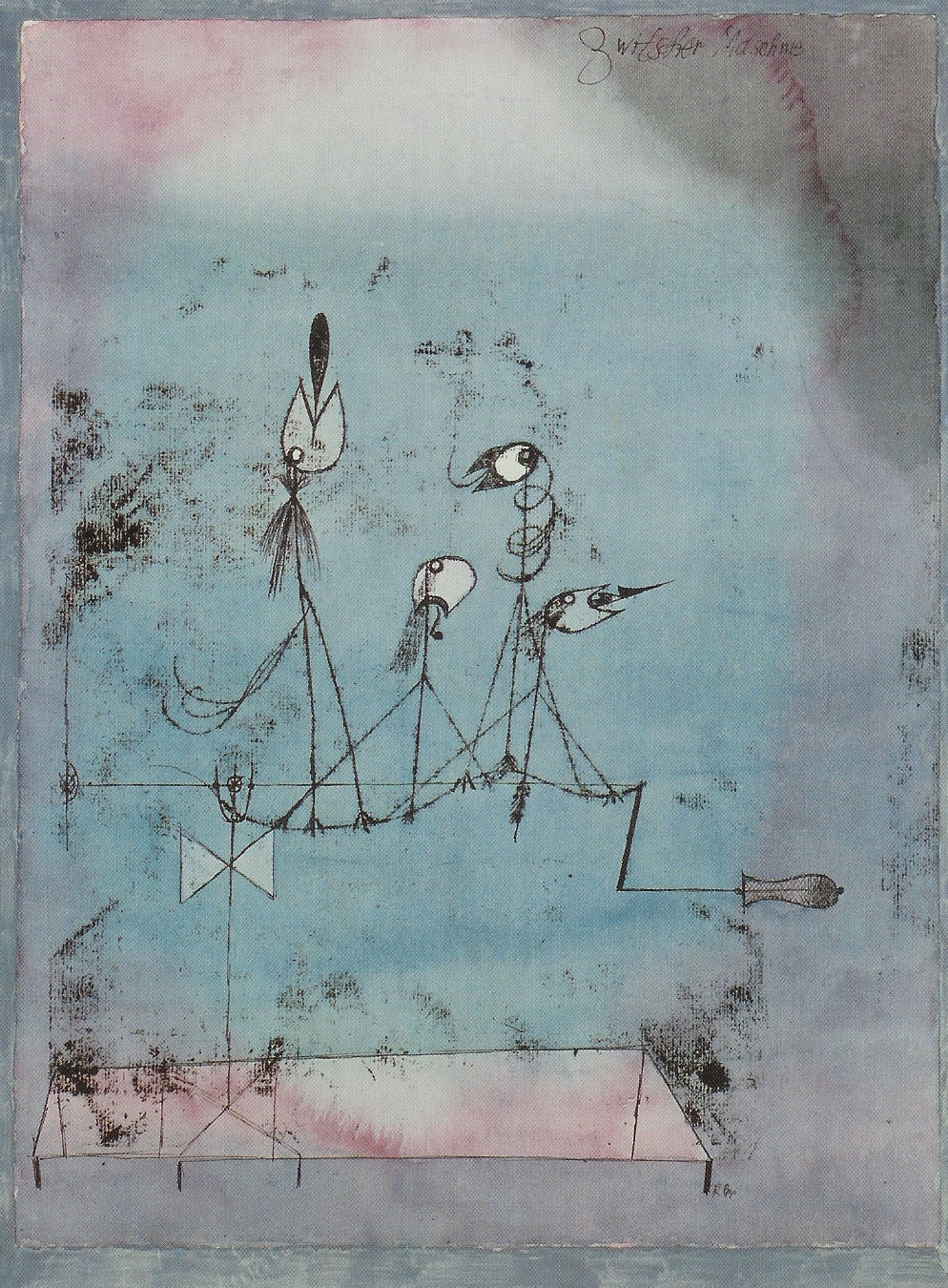
"Twittering Machine" Paul Klee


"Twittering Machine" is definitely one of my favorite paintings.  I've always been fascinated by Paul Klee's work...


especially his line drawings!  His lines look like a child's; very honest, strong, yet shaky.  You can tell he didn't try  


to perfect any lines by drawing over them.  The first mark he lays down stays as it is.  Klee used watercolors, pen


and ink to create "Twittering Machine."  I first saw this painting as a poster hanging on the wall in the drawing 


classroom at my high school, Dreyfoos School of the Arts, in Florida.  I was intrigued by the image...it was just so 


strange to me; these bird like creatures that look like they are a part of a machine, all singing, or being forced to 


make noise.  It was interesting - I didn't know how to feel about this painting.  This could either be viewed as a 

happy, 


upbeat scene, or a bizarre and eire one. At first glance though, I was simply inspired by the simplicity of the 

painting,


especially the line work.  The lines are wobbly, thin, delicate looking, yet there is still apparent line variation.  The 


colors are mostly pastels and are very cool.  Blues, purples, magentas, and greens 


fade and blend into each other. The colors are not very saturated, or opaque,but 


are more transparent, revealing the medium.  The texture is very watery and the volume is shallow, but there are 


blotches of dark ink smudged around the twittering machine, which helps set the focal point on the birds. There is 


not very much depth.  The image is kept simple and flat.